2nd August - 14th October 2012
During the summer, whilst visiting the Fringe Festival in Edinburgh, I went to see a really interesting and very thought provoking exhibition by German/Swiss artist & writer Dieter Roth (1930 - 1998). Dieter Roth kept a diary throughout his life recording lists, addresses, appointments, deadlines, ideas, photographs, drawings and poems. In the mid 1970's he attempted to record a year of his life by collecting and preserving all items of waste less than 5mm thick. The resulting work - Flat Waste - celebrates and subverts the ordering principles of a diary. Also showing was Solo Scenes - a vast video diary recording the last year of his life before his death on 128 video monitors.

Roths diaries

Roth's box files where his flat work pieces are organised and logged.
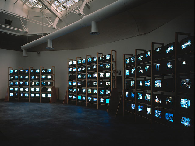
For his final project, Roth set up surveillance cameras all over his home and studio and filmed his every move for the last months of his life. Seen on the 128-screen rig now at the Fruitmarket gallery.
click to watch youtube video above about Dieter Roths work
To display the archival material collected by 20th century German artist Dieter Roth throughout his life, the Fruitmarket has transformed its upper floor into what appears to be the obsessively ordered library of an anally retentive architect.
Everything is filed, dated and shelved. The few things on display are, at first glance, small in scale.
Roth, who died in 1998 and left a body of work that ranges from sculptures and installations to films and books, was a compulsive diarist and detritus collector. He was constantly self-referential and an early incorporator of found objects into his collages and montages. This, for the first time, is the material in the raw.
In 1975, to make Flat Waste, he collected every piece of garbage that could be flattened into a ring binder. The original box files, labelled with the date and location, fill half of the floor space. Three folders are out for in-depth noseying: here is his Marlboro packet, the top of a beer bottle, a boarding card. The smell of tobacco smoke still lingers. It is part journal, part evidence from a murder scene, a year of a life in five chunky shelf units.
Roth’s copy books – scrap books made from his ongoing collections of drawings, photographs and stuff – were printed in small runs, for sale or as gifts for friends. Self-portraits dominate and a series of double-sided ones are cleverly displayed.
Some are heavily smudged and over-scrubbed, some so delicate they could be fragile tracings.
Other copy books display a less serious side: family snaps, defaced photo- booth pictures, wild freeform doodles. His actual diaries are tiny and methodical, with only the odd tiny image among to-do lists and appointments.
Roth recorded his final year in video format. Flickering on a wall of 128 monitors, this is not the florid confessional of the Big Brother house but an old man in his studio, reading in bed, washing the dishes, speaking on the phone.
A show that at first appears underwhelming turns out to be intimate and moving. In itself, it’s beautifully achieved. It’s just a shame that the body of Roth’s work is not better known, to put this revelatory private material in the context of his public output.
www.telegraph.co.uk/culture/theatre/edinburgh-festival-reviews/9456517/Dieter-Roth-Diaries-Fruitmarket-Gallery-Edinburgh-review.html

Whilst in Edinburgh I was lucky enough to see the Munch exhibition showing his graphic works - including the iconic image 'The Scream', 'Anxiety' and 'Madonna'
Norwegian artist Edvard Munch (1863-1944) is renowned for his preoccupation with universal emotions such as isolation, melancholy, anxiety and love. His graphic works are amongst his most arresting and poignant, and are celebrated world-wide for their technical mastery and visual intensity.
The exhibition was very moving, Munch aimed to reveal the psychological and emotional life of man, drawing on his own, frequently troubled experiences to fuel his artistic output. Rejecting Realism in favour of symbolist and expressionist styles, he stated, ‘No longer will interiors and people reading and women knitting be painted. There shall be living people who breathe and feel and suffer and love’.
My personal favourites in the exhibition were:
The Scottish National Gallery of Modern Art is split over 2 sites - Gallery One and Gallery 2. Set in beautiful grounds above Edinburgh they have a sculpture park in front of the galleries.
My favourite piece was this piece of work by Nathan Coley which features large outdoor work comprising illuminated text on a large scaffold support. The text on the sculpture is created by using light bulbs and having a personal interest in text used in art and a love of 'lights' i found it was a striking piece, it also made me smile.

'The words are divided into three lines, giving it the formal appearance of a haiku. The use of white electric bulbs, together with the unusual typeface, evokes 1970s disco glamour as well as fairground aesthetics, at once elegant and tacky, and at variance with the message of the text. Coley is a Scottish artist whose work explores society's expression of itself through the environment it constructs, whether through built architecture and monuments, or through intellectual and religious beliefs and systems'.
Scottish National Gallery of Modern Art
Edvard Munch | Graphic Works from The Gundersen Collection
Whilst in Edinburgh I was lucky enough to see the Munch exhibition showing his graphic works - including the iconic image 'The Scream', 'Anxiety' and 'Madonna'
Norwegian artist Edvard Munch (1863-1944) is renowned for his preoccupation with universal emotions such as isolation, melancholy, anxiety and love. His graphic works are amongst his most arresting and poignant, and are celebrated world-wide for their technical mastery and visual intensity.
The exhibition was very moving, Munch aimed to reveal the psychological and emotional life of man, drawing on his own, frequently troubled experiences to fuel his artistic output. Rejecting Realism in favour of symbolist and expressionist styles, he stated, ‘No longer will interiors and people reading and women knitting be painted. There shall be living people who breathe and feel and suffer and love’.
My personal favourites in the exhibition were:
 |
| 'Madonna' |
 |
| 'The Scream' (Lithograph) |
'Two Human Beings - The Lonely Ones'Scottish National Gallery of Modern Art Sculpture Park |
My favourite piece was this piece of work by Nathan Coley which features large outdoor work comprising illuminated text on a large scaffold support. The text on the sculpture is created by using light bulbs and having a personal interest in text used in art and a love of 'lights' i found it was a striking piece, it also made me smile.
No comments:
Post a Comment